What Is The 60-30-10 Color Rule?
What Is The 60-30-10 Color Rule?
It is an effective design technique that involves three-color ratios. Essentially, 60% of your space is filled with one neutral color, while 30% of it is your secondary color, and then 10%is allocated to the accent colors. This is the most commonly used method to apply this rule.
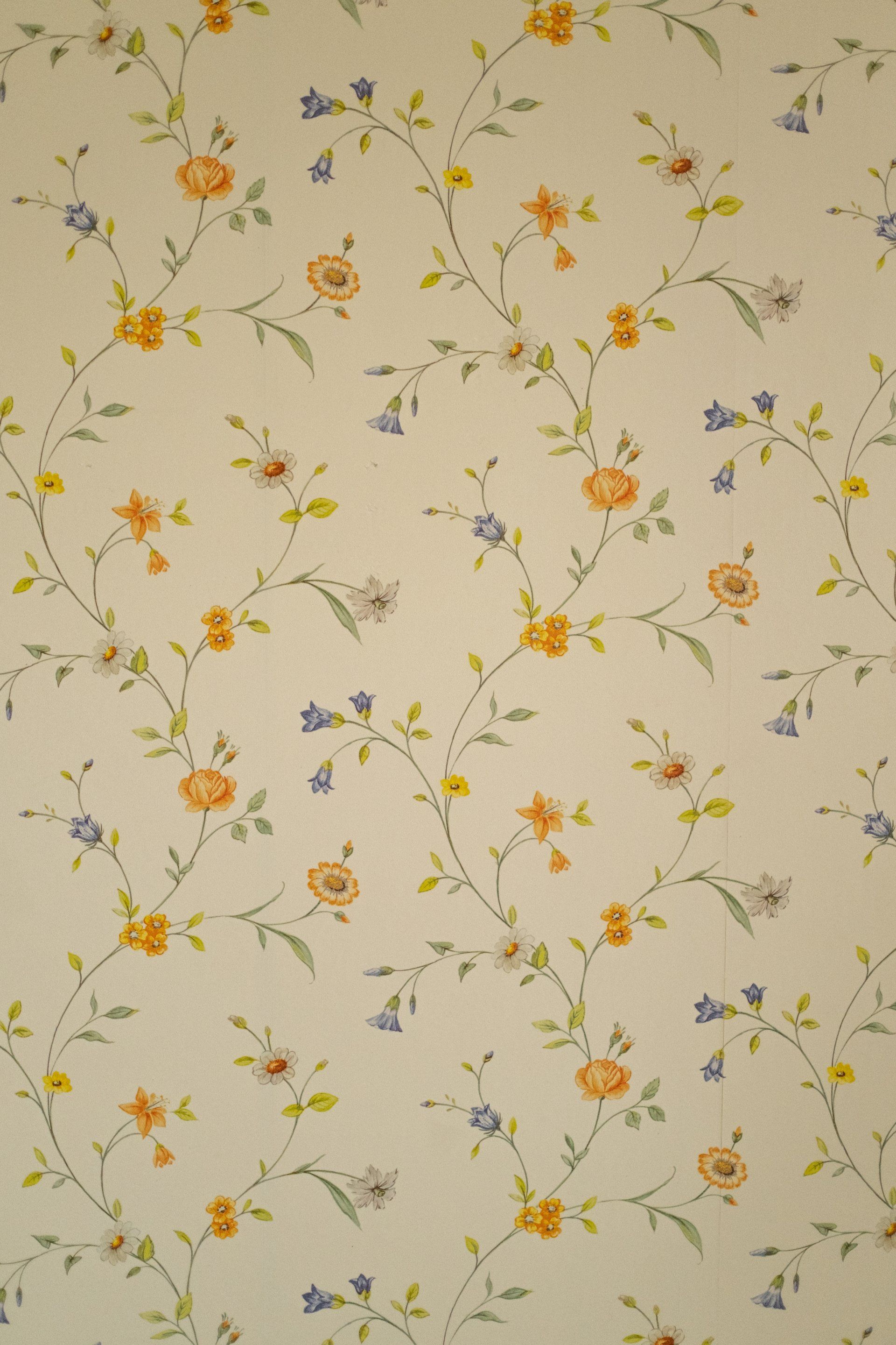
- 60% - wallpaper or paint
- 30% - big sofas and other large furniture for storage and cabinets, appliances
- 10% - furniture that is a smaller table, side tables, and other decorative items
It is important to think about a variety of aspects of the design before you begin the process of a complete makeover or remodel of your kitchen, bedroom, bathroom, or family room. The most important one, perhaps, is the color.
There's much to think about, such as furniture, walls, countertops, ceilings, cabinets, and many other places. How do you choose the right color? It will depend heavily on the size of your furnishings or decor, too. Typically, it is best to employ neutral colors as the base and use colorful colors only sparingly.
The hue of a room can affect how people feel once they walk into it. The blacks, blues, purples, and grays typically make rooms feel more cold, while reds, yellows, and oranges can make rooms feel warmer. Neutral colors like whites, shades of cream, and even tans are able to counteract the more intense shades.
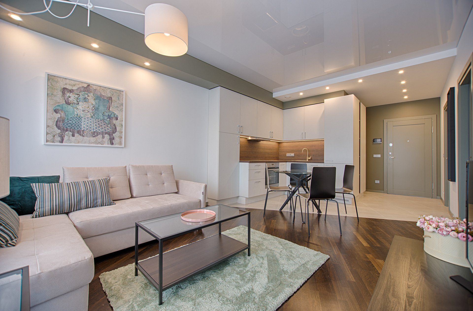
60 - The Majority Rules!
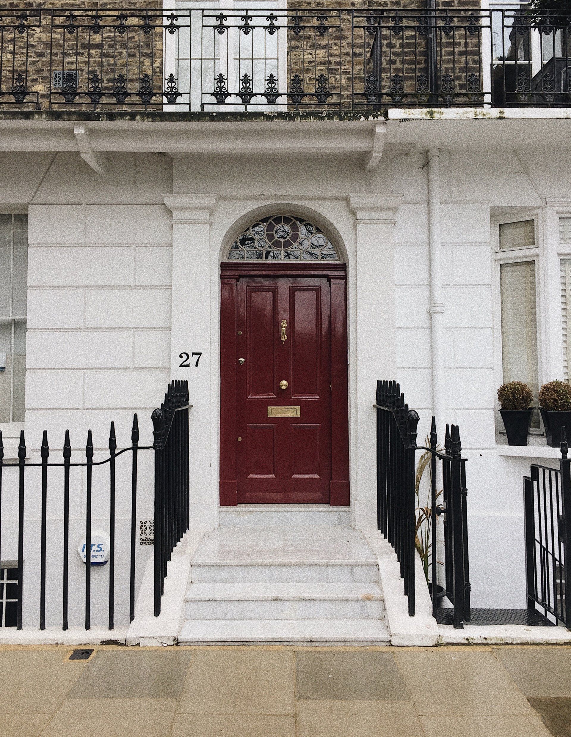
Your walls are likely to constitute most of the 60% or perhaps the furniture pieces in your room. If you're renovating your family room, bedroom, or playroom, it is likely that your walls be the best fit for your room when they're identical in color. Furniture that is larger, like chairs, couches, gaming tables, desks, and beds, are usually similar colors also.
The most popular colors for this category are neutral shades, as 60% of the colors take up the majority of your room. Whites, creams, shades of soft yellows, tans, and even greens with a muted hue are all great choices.
However, there's a bit of discretion with this rule. For instance, some homeowners might choose to decorate a part of their walls with an intense color such as blue or green instead of a neutral hue such as white or tan. Another trend that is common is matching walls to floors or cabinet color. This creates a uniform look in the kitchen.
In certain instances of kitchens, there is an island that is matched to the cabinets or walls; however, the countertop on the island will be a match to the rest of the counters.
30 - What's Your Secondary?
The color you choose for your secondary room will make up approximately 30% of your space and is likely to be similar to the predominant color. The color you choose for your secondary isn't overly exaggerated, but it isn't too neutral.
If you've picked white or cream for your space or room, a light blue, yellow, or green could be an ideal secondary color. Most often, these colors will be from medium-sized or small furniture pieces, carpets, or rugs.
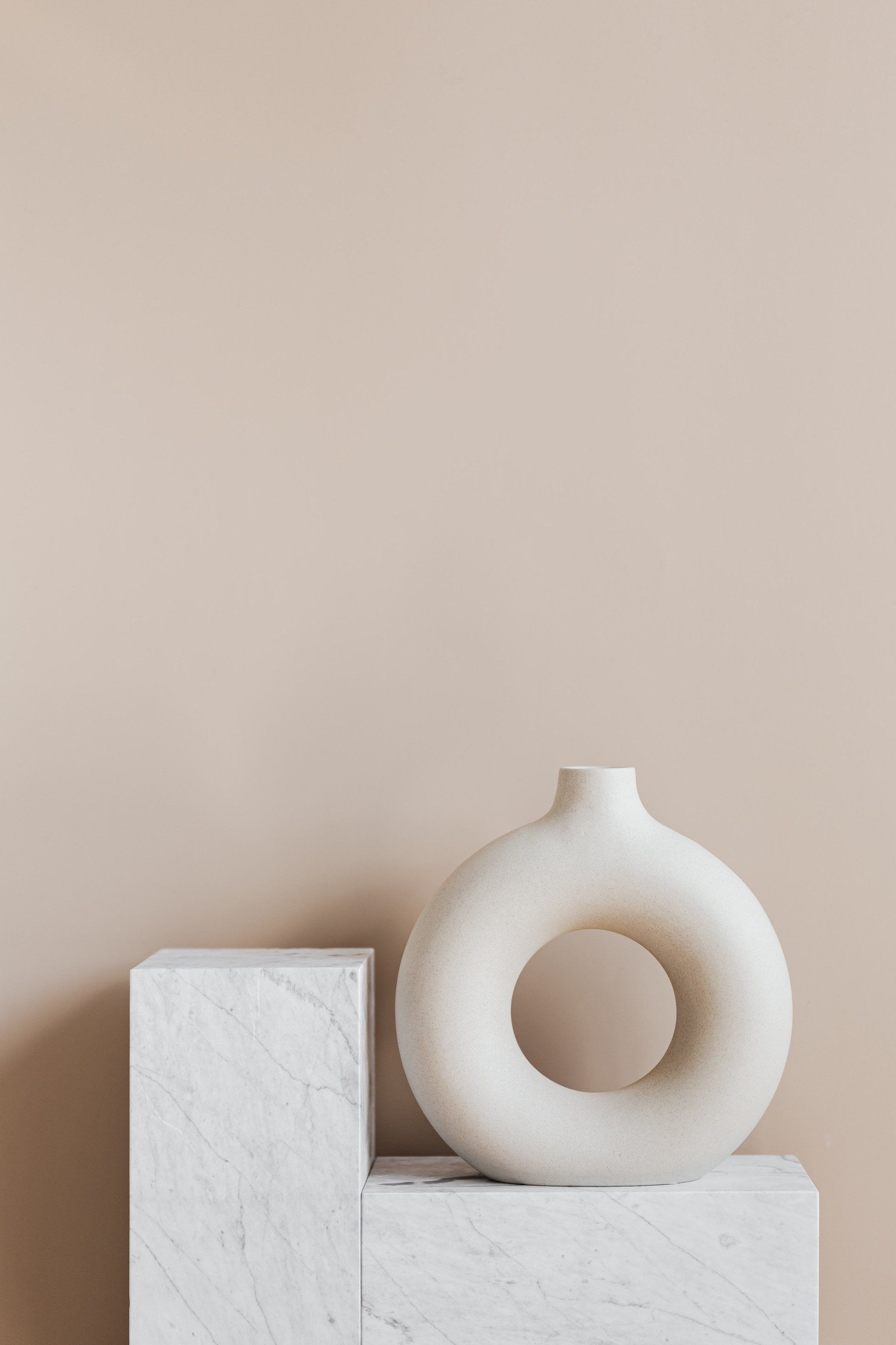
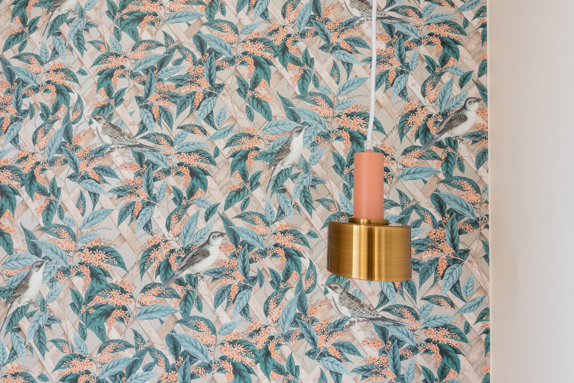
10 - Your Accent!
Your accent colors will add the accents to your space and make up the smallest amount of the color. Blue-toned walls are juxtaposed by orange accents on pillows (complementary shades! ) as well as the stools that are on the other side of bed as well as artwork above the bed.
Some people would like their preferred color to be their primary color, but most of the time, their favorite colors are loud, vibrant shades that make rooms shout. Perhaps the most effective way to design your space is to choose your most preferred color and make it the accent color and not the main color. And then, take it from there! So, you can retain your preferred color and still have a balance of hues in your room.
GET A FREE QUOTE
Send us your details and we’ll get back to you to schedule a time to talk.
Edmonton Interior Design Quote